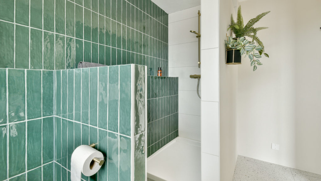
The right tile can transform a bathroom from purely functional to genuinely memorable. Pattern, scale, color, and grout all work together to influence how big a space feels, where the eye lands, and how the room ages over time. Here’s a practical guide to tile choices that consistently elevate bathrooms—whether you’re refreshing a powder room or redesigning a full primary suite.
Start with Pattern: Shape Guides the Mood
Subway (Classic Stacked or Offset).
A timeless option that plays well with nearly any style. A 1/3 or 1/2 offset adds movement; a stacked layout reads modern and minimal. Use vertically to visually heighten walls in low-ceiling spaces.
Herringbone & Chevron.
These diagonal patterns inject energy and direction. Narrow planks or 2×8/2×10 ceramics set in herringbone elongate a room; chevron delivers a crisper, tailored look. Great for feature walls behind vanities or in shower stalls.
Basketweave & Pinwheel.
Perfect in traditional or transitional spaces, these micro-patterns bring subtle detail without shouting. They pair well with marble or marble-look porcelain and feel “finished” in small baths.
Hexagon (Micro to XL).
From 1″ mosaics to 12″+ slabs, hexes adapt to many aesthetics. Smaller hexes deliver vintage charm; larger formats skew contemporary. Use a tonal grout to keep it calm or a contrast grout to show off geometry.
Kit-Kat/Mosaic Finger Tiles.
These skinny strips create gorgeous texture, particularly when run vertically. They suit spa-like, modern designs and shine as vanity splashes or shower accents.
Large-Format Porcelain Slabs.
Fewer grout lines equal a cleaner, more expansive feel. Book-matched veining or subtle cement looks can turn a compact bathroom into a serene retreat.
Color Strategies That Always Work
Monochrome with Texture.
Stay within one hue family (e.g., warm whites or greige) but layer textures: matte wall tile, glossy shower tile, honed floor. Light bounces differently across finishes, creating depth without visual clutter.
Tone-on-Tone Neutrals.
Mix warm beiges, creams, and light taupes for a soft, elevated palette that flatters skin tone in mirrors and feels timeless. Ideal for small baths and resale.
High-Contrast Black & White.
A classic that photographs beautifully. Keep the balance roughly 70/30 (more white than black) for brightness, using black as frames (niche insets, base borders, or a single feature wall).
Earthy Greens & Blues.
Sage, eucalyptus, and ocean blues feel fresh yet restful. Pair with warm brass or brushed nickel fixtures and lightly variegated white tiles to avoid heaviness.
Color Blocking for Impact.
Use one saturated hue (midnight blue, forest green, terracotta) on a single surface—the vanity wall or shower—and keep all other planes neutral. This isolates color as a focal point and prevents overwhelm.
Grout: The Unsung Design Tool
- Match for Minimalism: A grout that closely matches tile color creates a seamless, larger look—great for small rooms.
- Contrast for Pattern Pop: Dark grout with white tile (or vice versa) emphasizes shape (subway, hex, herringbone).
- Practicality: In high-traffic or family baths, medium-tone grout hides wear better than pure white or deep charcoal.
Finish, Sheen, and Slip
- Matte Floor, Satin Wall: Matte floors increase traction; satin or semi-gloss walls are easier to clean.
- Glazed Texture in Showers: Slightly rippled or zellige-style glazes add artisanal depth and reflect light beautifully.
- Stone-Look Porcelain: Delivers luxury vibes with less maintenance than natural stone—especially smart for steam showers.
Layout Tactics to “Grow” the Room
- Run Tile Vertically: Makes ceilings feel taller (great behind mirrors and in showers).
- Continue Floor Tile into Shower: One plane, one pattern—reduces visual breaks and expands the perceived footprint.
- Frame a Feature: Border a herringbone or mosaic panel with field tile to create a custom focal point at a reasonable cost.
Sample Palettes That Elevate
Spa-Soft Neutral
- Walls: 3×12 off-white finger tiles (vertical stack)
- Floor: 2″ warm gray hex mosaics (matte)
- Accents: Natural oak vanity, champagne bronze fixtures
- Grout: Matching off-white walls, mid-gray floors
Modern Monochrome
- Walls: 24×48 white porcelain slabs (honed)
- Floor: 24×24 light gray concrete-look
- Feature: Black hex niche back and shower base border
- Fixtures: Polished nickel for crisp contrast
Earthy Luxe
- Walls: Hand-glazed sage subway, 1/3 offset
- Floor: Honed marble-look porcelain with soft veining
- Feature: Herringbone insert behind vanity in the same sage
- Metals: Brushed brass; Wood: walnut vanity
Common Mistakes—and Easy Fixes
- Too Many “Stars.” Pick one hero (pattern, color, or material). Keep others supportive.
- Ignoring Undertones. Warm floors (orange oak) can clash with cool grays. Sample tiles in your actual light, against your existing finishes.
- Over-Small Tiles on Large Floors. Excess grout can visually shrink the room. Use mosaics selectively (showers, niches, borders).
- Skimping on Waterproofing. Stunning tile won’t save a poorly prepped substrate. Confirm membranes, slopes, and transitions.
Where Professional Help Pays Off
Complex mixes—patterned floors, niche accents, slab walls—demand careful planning for cuts, slopes, and grout joints. A seasoned bathroom remodel contractor can map layouts to avoid sliver cuts, align sightlines, and coordinate waterproofing so your design endures daily use.
Thoughtful tile pattern and color choices amplify light, clarify sightlines, and add personality without sacrificing longevity. Start with the room’s constraints (size, light, existing finishes), choose a single focal idea, and let every other decision reinforce it. The result: a bathroom that feels balanced, beautiful, and built to last.


Comments are closed.